O!M Yoga,
Space for balance.
Fluid form.
A calm rhythm.
The idea
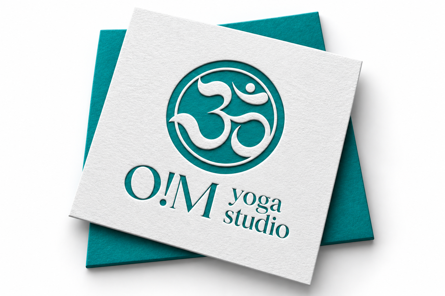
A rounded symbol and turquoise palette give O!M Yoga a gentle character. The enlarged logo reveals the symbol’s lines, the lettering and their relationship.
O!M YOGA / DESIGNBETTY
Breathe in.Breathe out.Balance.
Yoga studioA soft line.
A grounded identity.
Visual language
The rounded symbol is paired with calm lettering. Turquoise sets the mark apart from its light background, while generous space keeps the composition light.
01
02
03
04
Presentation colour palette.O!M Yoga
About the project
Symbol and name form a compact composition. White texture and turquoise make the mark stand out while retaining a calm impression. The enlarged scale reveals its details.
Design by DesignBetty. Product visualisations and editorial layouts were created to present the work. These are concept images, not photographs of a produced project.
View the original design