Pocket Bunny Pepper,
A spicy personality.
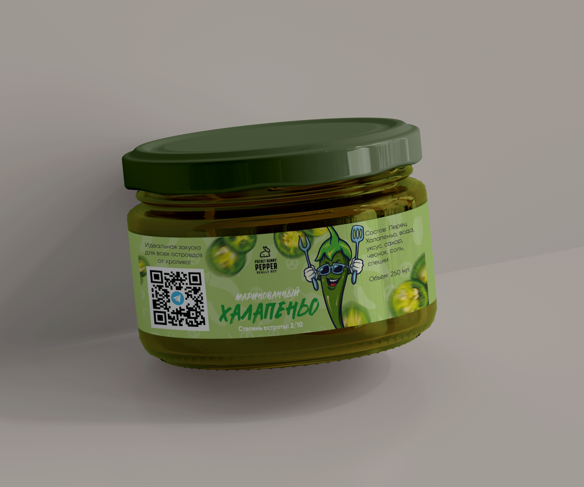
A small jar.
A bold personality.
The idea
The label combines illustration with product information. A character and green tones connect the design to peppers, while contrasting text highlights the name and heat level.
Illustration sets the mood.
Visual language
Green connects the label and lid. Light areas give the text space within rich graphics, while varied lettering sizes separate the name from product details.
Design colour palettePocket Bunny Pepper
About the project
A green palette, pepper character and bold name come together on a pickled jalapeño label. Illustration sets the mood, while distinct text blocks communicate the product and heat level.
This case study presents the label design. Close-ups reveal details of the original work.
View the design