Vikfort,
Confidence in simple forms.
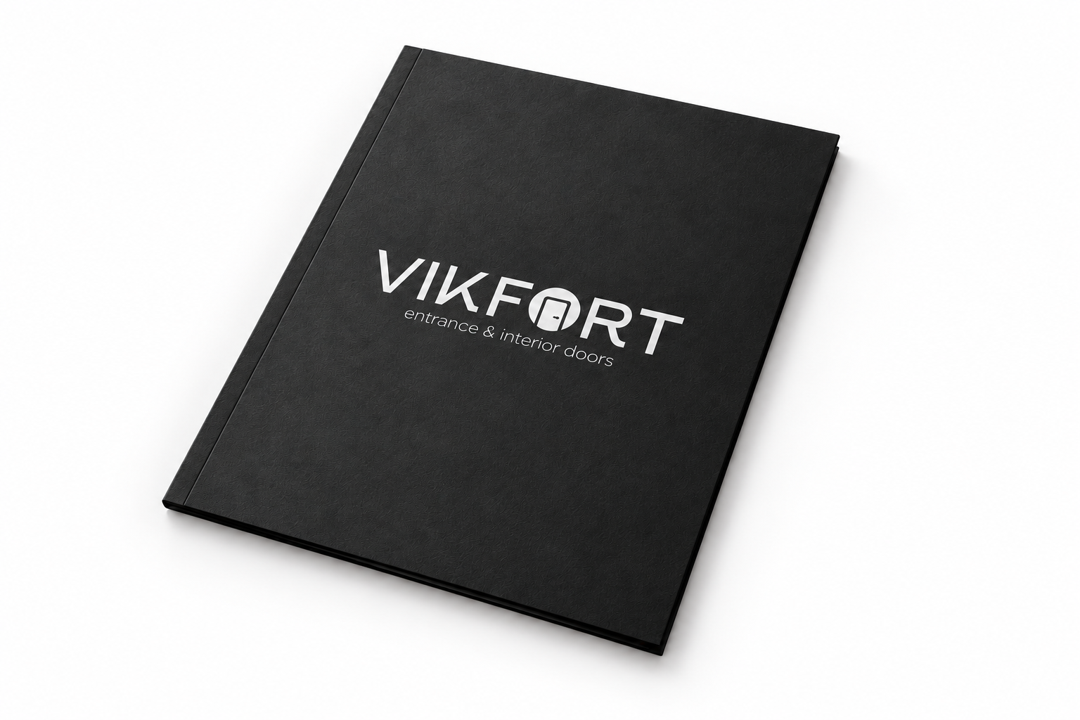
A precise mark.
A quiet character.
The idea
Entrance and interior doors are products where proportion and reliability matter. Vikfort’s logo combines structured lettering with a doorway inside a letter, connecting the name to the product.
VIKFORT / DESIGNBETTY
Form.Function.Character.
Doors and interiorsArchitecture
within the name.
Visual language
Straight lines and a doorway inside a letter connect the mark to the product. A monochrome presentation reveals the proportions and keeps the focus on the name.
01
02
03
04
Presentation colour palette.Vikfort
About the project
The monochrome logo is presented on a black folder. A light mark against dark material draws attention to the lettering, while the quiet composition supports its architectural character.
Design by DesignBetty. Product visualisations and editorial layouts were created to present the work. These are concept images, not photographs of a produced project.
View the original design