Shared Quest
A visual identity designed to make a tabletop game brand feel instantly recognisable, sociable and full of possibility.
The business need
Shared Quest needed a visual starting point that could bring people into the game before a single card was played. The brand had to feel lively and friendly, while still being clear enough to work across the product, launch communication and future game nights.
The goal was not simply a logo. It was a recognisable visual world that could help a new game stand out in a crowded, highly visual category.
What I designed
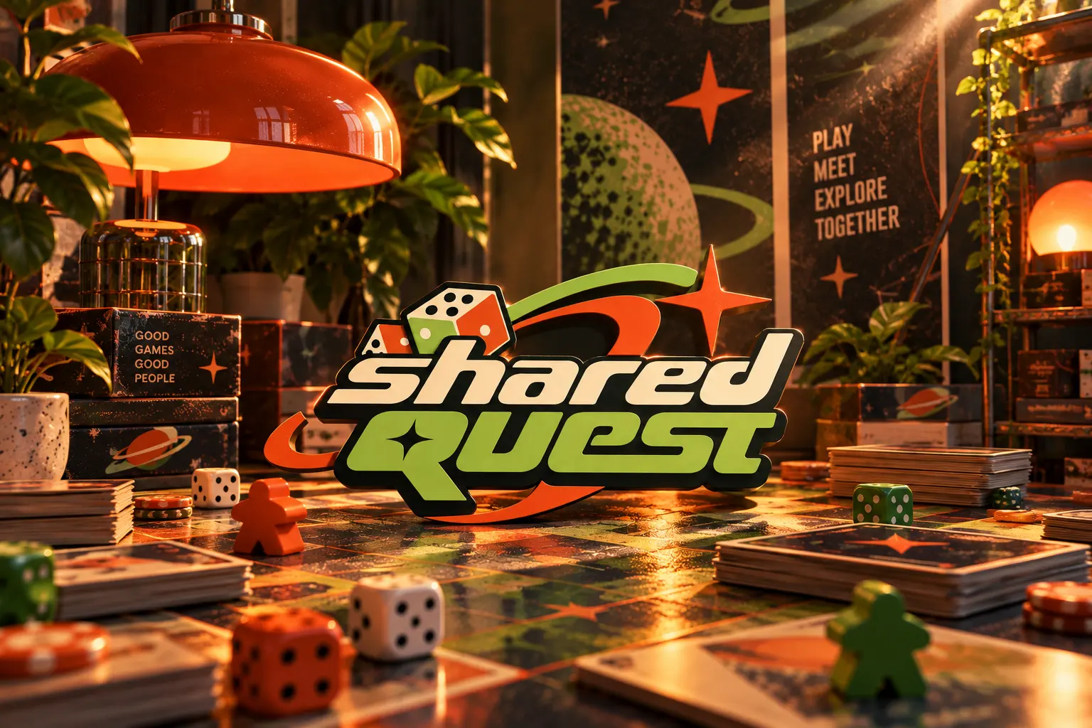
I developed an energetic logo direction built around movement, play and shared discovery. Bold type, dice-inspired details, orbit-like shapes and a limited high-contrast palette give the identity a distinctive character without making it difficult to use.
The visual language was considered as a system: it can frame the brand name, carry short messages and create a consistent atmosphere across physical and digital touchpoints.
What the client received
- 01 / Brand markA logo direction with playful details and a clear silhouette.
- 02 / Visual languageColour, typography and graphic elements that make every touchpoint feel part of one world.
- 03 / Launch-ready directionA flexible foundation for game packaging, social content, event materials and future campaigns.
- 04 / Presentation assetsMock-ups that show how the identity can live in the game environment.
The result
Shared Quest now has a clear visual character: playful without being childish, expressive without losing readability, and flexible enough to grow with the game.