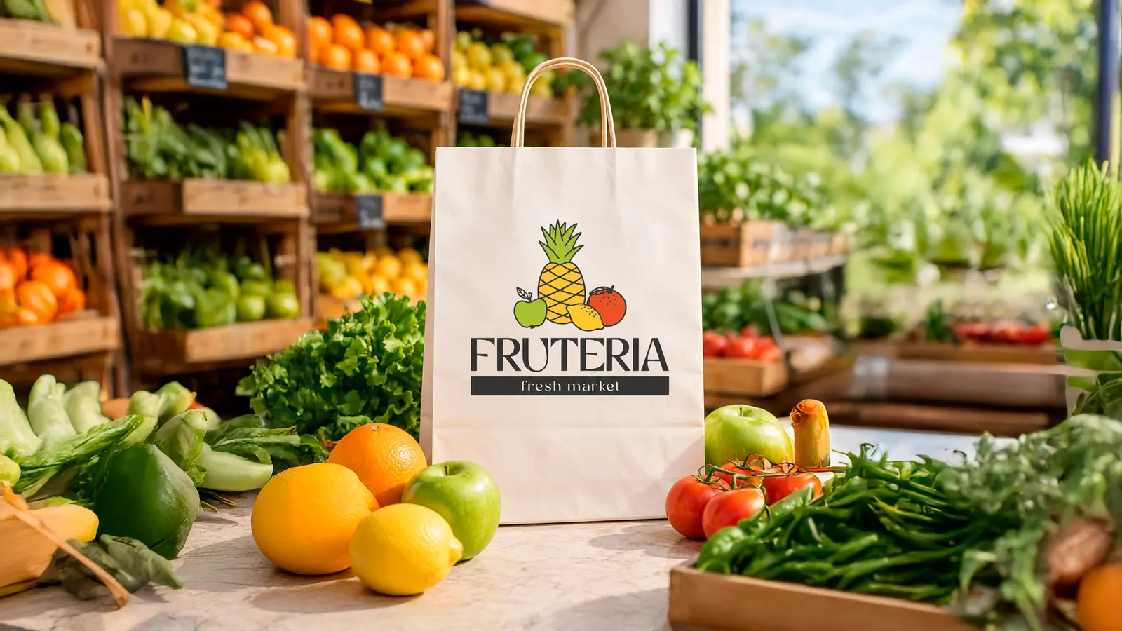
Relevant project
Fruteria identity
A friendly food market identity with a bright, instantly recognisable fruit illustration system, applied to a real shopping-bag mockup.
View portfolioFor food and beverage brands, the pack often has to tell the story before anyone tries the product. I design clear, appetising and ownable packaging systems that work on the shelf, online and in your customers’ hands.
Good packaging balances appetite, clarity and character. It helps a customer understand what they are buying in seconds while building recognition that makes the next purchase easier.
A friendly food market identity with a bright, instantly recognisable fruit illustration system, applied to a real shopping-bag mockup.
View portfolioWe clarify the product, customer, sales channel, mandatory information and the competition beside you on the shelf or screen.
I build a visual route around the product’s most useful story: flavour, origin, benefit, mood or the world of the brand.
The final layout is refined for your format and delivered in organised files ready for the next production step.
Food market identity with a cheerful illustrated mark designed to feel fresh and approachable.
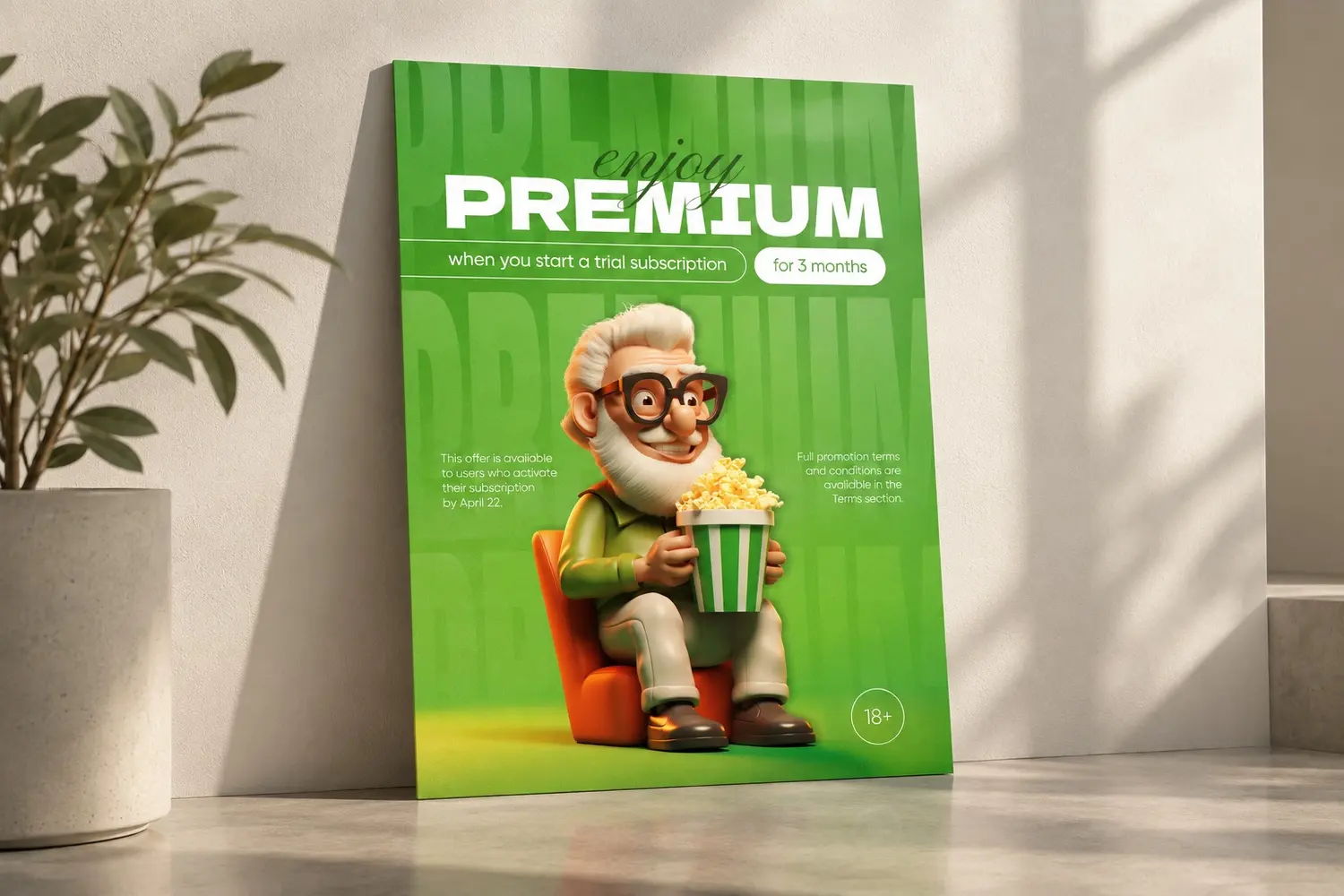
High-contrast campaign design showing how one visual idea can make a promotional message hard to miss.
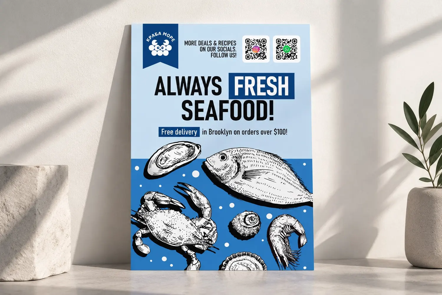
Illustration-led promotional design for a food offer, built around clear hierarchy and instant category recognition.
Yes. Send it with the brief, along with any technical requirements. If it is not ready yet, we can develop the visual direction first and prepare the final artwork once the format is confirmed.
Yes. We can create a repeatable system so the family is recognisable while each product remains easy to identify.
Yes. For a new brand, starting with an identity can make the packaging faster and more coherent. We will choose the right scope in the first consultation.